
HOME TOUR

Oh friends you have been so patient with me! So many of you have asked for details on our kitchen and pictures and we’re finally here. I wanted to wait until touch up painting was done and the french doors into the mudroom were in and then it got decorated for the holidays and I didn’t want to take everything down just to take pictures. I can safely say, we’re finally done! So welcome to our brand new kitchen. Many of you watched the remodel progress from breaking ground the end of October 2017 up until it was finished in the summer of 2018, you can get caught up and see “before” pictures, here and here. If you’re new to our home, welcome. It’s an 1879 farmhouse victorian outside of Boston. We bought it in June 2015 and knew it needed some love, by “some” I mean “holy moly it smells like cat pee.” Being an old home, there was lead, steep staircases, candy-colored pastel walls (as seen in this post) and closed off rooms. But from the minute I walked inside it spoke to my heart, cat pee smell and all. It had tall ceilings at 9.5+ feet and character, huge windows and a pretty porch, it just needed a little lovely.

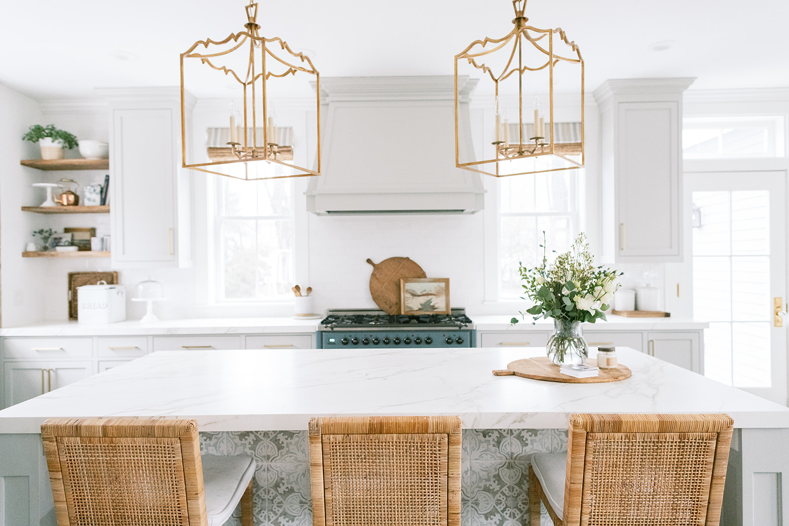
When we started this remodel I was asked for a “must have” list. I found it the other day and we were able to implement every single item with some compromises. There are always compromises. We now have an open family room and kitchen, large island (4′ x 8′ ft), window nook, and lots of natural light. Everyone was patient with me as I doodled out how I wanted things to look, from the range hood to the bumped out sink nook with antique barnwood beams. Design is my passion and I had some very specific opinions. This was my first opportunity to design a kitchen from the ground up, the bonus is it’s mine. I poured hours into mood boards for my kitchen, tested probably 20+ samples of grey/greige paint for the cabinetry and searched for the perfect tile.

CABINET PAINT
Our cabinets are Sherwin Williams Repose Grey. I love this color but it does read differently in different lights. To my eye, in my own kitchen with all the natural light it feels warmer than it sometimes appears in pictures. Take this picture above and below, see how the tone varies slightly as light bounces off it. These pictures are brightened but I feel like that makes the pictures better represent my real life experience with this color in my own home. Some find it too dark if they have less natural light. Try Repose Grey at 50% strength in that setting.


CUSTOM INSET CABINETRY
The custom cabinetry was made by JD Millworks in Ashland. They were fantastic to work with, timely and thoughtful. All the cabinetry is an inset style vs the more common (and less expensive) overlay design. I wanted the modern feel of inset cabinetry but it was the most expensive element of our kitchen followed closely by kitchen appliances. The cabinetry is SW Repose Grey which for me was the perfect grey, warm with no weird purple undertones. We only have two upper cabinets in the whole kitchen and I was initially concerned about storage but we have so much storage in the island (which is 4′ x 8′), there are still a couple drawers with nothing in them. The upper cabinet closest the sink nook has our glasses and plates and the one to the right of the range has baking ingredients. That bottom cabinet below the baking cupboard has my kitchen aid mixer on a stand. We used this stand but know you have to buy the wood piece separately. For a couple hundred dollars, this has been a game changer for me. I designed this portion of my kitchen to be my baking area. The drawer to the left has rolling pins and baking spices, a drawer below has my mixing bowls. Think about how you use your space and design areas that increase your functionality.

I don’t have a walk in pantry. This was a compromise because I wanted one. But we do have a Butler’s pantry which connects the kitchen to the dining room and has floor-to-ceiling cabinets and a small counter sink space for our coffee/tea bar. We had two outlets added to the underside of the island so we can plug in appliances or a laptop–super handy, definitely think about your outlet placement. The cabinet hardware is the 8″ Edgecliff Pull by Schoolhouse Electric in natural brass.
JD Millworks also did the stain on our refrigerator/freezer unit that is made to look like an old icebox. This was a bespoke design and I do not have the stain info. We went through several iterations of the stain to get it right, I knew exactly what I wanted and they pulled it off to perfection. This built-in design for the refrigerator/freezer was made possible by going with what is called an integrated system. Now typically when you have a built-in refrigerator you can still see the venting above even if the doors have cabinetry panels. Only Subzero and Thermador appliance brands (that I’m aware of) have the option for a fully integrated refrigerator/freezer with zero seams and no visible venting. The cabinet above the freezer/refrigerator is an actual cabinet. We went with two 24″ Subzero Refrigerator and Freezer units (a total width of 48″ + the cabinetry sides) and did that on purpose for symmetry so it could be built in like a piece of furniture. The panels on the front have large pulls, ice box hinges and a latch that is decorative.


NEOLITH STONE COUNTERS
The stone counters were completely new to me. I was downtown at the Clark Showroom in Boston looking at the Subzero refrigerator and Wolf ranges when I noticed their long island and commented to the sales lady how I really wanted marble but knew the kind I wanted wasn’t going to be in the budget and my hubby would never go for it knowing the upkeep with three kids under 6. She said, “honey, this is an amazing product called Neolith. It just looks like marble.” Designers everywhere say they love the “patina” of marble and I really do want to hug the slabs every time I go to the stone yard. But the reality is our real calacatta marble-topped tulip table in the nook already looks terrible. I can’t visualize what kind of etching on marble actually looks good. Would I still prefer the beautiful veining of an expensive marble? HANDS DOWN YES I STILL DROOL EVERY TIME I GO TO THE STONE YARD. But I’m not sure how to make it work with all the pomegranates we eat, Easter egg dye, projects we’re gluing together on the island and all the life that happens in here. Everyone has a strong preference about counters and there’s literally no perfect option, this is a “you do you” thing.

I researched the heck out of Neolith, started seeing it in upscale homes online and when looking for stone at Marble and Granite Inc in Westwood, found a slab of the Neolith in the Calacatta color in a far corner and was sold. Ours is the matte finish Calacatta color with a 2″ overhang so it looks like a 2″ thick slab of marble. I think it isn’t as popular as it could be because people simply don’t know about the awesomeness that is Neolith and stone yards hide it because you need a good fabricator (we used KB Surfaces is RI). It’s only about 1/4″ thick and apparently not easy to work with. But what you gain is a surface, either shiny or matte, that looks like marble, never fades, is super resilient to scratching or staining and isn’t grainy like quartz. It also requires no special cleaning products, which after the whole living through a pandemic thing, I’m super thankful to be able to Clorox them down. We’re normally as chemical-free as we can be, I clean them with a combo of cleaning vinegar and water and it doesn’t etch. I’ve walked on it, we’ve finger painted on it. Aubrey got ahold of a permanent marker and went to town (Magic Eraser takes every stain out and doesn’t ruin the surface). It’s amazing and my number one asked question when people see my kitchen.
Unlike quartz which is composed of 90% ground stone and roughly 10% resin and dye, Neolith is 100% stone, finely ground and compressed under high heat. Some people have referred to it as a porcelain but the company never uses that word so I’ve never referred to it as that. I know quartz is the usual winner for countertops because it doesn’t etch like marble and is easy to fabricate but I don’t love the grainy look to the quartz. This was 2016/2017 and I know technology is always getting better but for me at the time, Neolith was the perfect choice. We couldn’t be happier. Do your research and go with what you love. There will never be a right or wrong answer here. Don’t let anyone tell you otherwise. You can see it being installed in this kitchen post.


BACKSPLASH TILE
The backsplash tile is a white handmade subway tile that we got from Tiles Plus More in Natick. This particular one is by Advance Ceramics and is made in Spain. We bought it in two sizes, 3 x 6″ and 3 x 12″. It has a wavy appearance and catches the light nicely. I had the tile guy lay it in a completely random pattern (which threw him off initially but he loved it after awhile). You don’t see this often but boy is it pretty. Subway tile is such a versatile tile and can be laid in interesting ways. Add this to your list of possibilities. White grout makes it blend seamlessly with the white walls in our kitchen and family room, (Benjamin Moore Chantilly Lace).


ISLAND TILE
The tile on the back of the island was a design element I hadn’t seen many places but loved on a restaurant bar in New York City. I was sold when I realized what a pretty design element it added and although trendy, I knew that I could add a wood panel down the road if it drove me nuts. The truth is, it is easier to wipe dirty feet marks off tile than wood. I really loved this hand-painted Tabarka tile and almost put it on the backsplash. But I’m glad it’s on the island because it adds the wow factor without being overwhelming. It is the Nord-7 pattern in the colors oxford grey on lavan with the colors going all the way to the edge. The counter stools were initially the French Contemporary Square Counter Stool from Restoration Hardware, now I have the Balboa counter stool from Serena and Lily. Once again, my wolves, ahem children, ruined the upholstered stain-resistant fabric. If you have young kids, consider a removable cushion counter stool that you can throw in the wash. I love the Serena and Lily stools.

WOVEN WOOD BLINDS
The woven wood roman blinds are from The Shade Store. They are in the Montauk line in Morel color with privacy lining. They’re beautiful and are so well made. I know windows can get overlooked but woven wood blinds are my go-to design element to add warmth and that tailored, finished look to a space. Don’t overlook your windows. I added a decorative fabric panel which you can read about in this post.


KITCHEN LIGHTING
The pendants over the island are quite the statement. I feel like every kitchen needs something. These are the Darlana Fancy Lanterns in brass and in size medium. They are 36″ off the island because we have tall ceilings. The pendant over the sink window nook is the Mini Boston Pendant in aged brass, size small with a milk glass shade. Our electrician cut the stem down so it doesn’t hang down quite so low, currently 21″ from the barnwood beam. The pendant over the breakfast nook table is the Goodman Pendant in size large and in antique white. I had the electrician come back and try to lower it a bit but we must have accidentally thrown the extra spacers out and all the chain links were solder together. So we gave up, it doesn’t quite meet the standard “norms” for hanging height but there’s not much I can do at this point.


SINK DETAILS
The window sink nook is a favorite of mine. I knew I wanted it framed all the way around with reclaimed barnwood so we headed down to Longleaf Lumber in Cambridge, Ma. I spent several hours (and many splinters later) digging through reclaimed beams and boards. We ended up going with a solid beam to span the width of the nook and then finding long flat boards of matching scraped barnwood that the amazing guys at Cutting Edge used to make the “beams” going down the walls. They also framed out the inside of the slanted ceiling. We got enough boards to make the open shelves in the kitchen and above my desk. We mounted the Mini Boston Pendant directly to the wood beam.
The sink is a Julien Fireclay sink with flat apron front, it’s the 28 1/4″ x 17 1/2″ x 10″ model. The Faucet is by Rohl, the Italian Patrizia Pull Down Kitchen Faucet and is from Designer Bath in Watertown, Ma. When you are standing at the sink, the cabinet to the right is the dishwasher and the cabinet to the left is a pull out trash can / recycling.


ILVE 48″ MAJESTIC RANGE
The kitchen range is a 48″ Ilve Majestic in the custom color Blue Grey 7031. You can read all about it here. It’s such a beautiful range and I’m SO happy with it.


I hope you’ve enjoyed our kitchen reveal…finally! I probably forgot some detail and will have another post on our Butlers Pantry because it still needs a little organizing love/I forgot to take pictures of it.
These beautiful pictures were captured by Madison Rae Photography and Ruth Eileen Photography.
Disclosure: This post contains some affiliate links with Reward Style which means I may receive a commission if you click a link and purchase something that I have recommended. These are all products I have bought or are as similar as I can find and I am happy to inspire you. Clicking any links on Finding Lovely will not cost you any extra money but it does help this stay-at-home momma keep this site up and running smoothly with limited ads!
57 responses to “Our Kitchen Reveal…finally!”
Leave a Reply

 comment share
So dreamy!!!!
Thank you Brenda!
Absolutely gorgeous! I am dying over those lanterns, and the cabinets. And what about those rustic beams. I have shown pics of your kitchen to the owner of a local sawmill, (and anyone else who asks about my kitchen design), which he used to make my two beams for my kitchen!!!! Seriously, you have inspired me beyond!!!!❤️
Awww I’m so glad! That’s the whole point. I love that it inspires others! 🙂
Every single thing is perfect! Just beautiful ❤️
Thank you Katie!
I’m sure you meant “peeks”— and I did ! So many great ideas here.
Thank you Teri, I swear I proof read these things like 100 times. That’s probably the problem. Haha! That and having a newborn. I’m glad you found it helpful!
This is so beautiful
Thank you Elizabeth!
This is the most beautiful kitchen I have ever seen!! We just bought an old farm house (1846) on cape cod and we are planning our kitchen renovation. I just met with our designer and showed her your kitchen as my dream kitchen. Thank you for the inspiration! And … I didn’t know you are an RD – so am I! Makes me love your stuff even more.
Awww Jenny how fun! Good luck on your renovations. I’m humbled you’re using this as inspiration. And Yay to a fellow RD!
Gorgeous!! We are redoing our kitchen & your wall tile is EXACTLY what I’ve been looking for! Also, learned about Neolith through your blog, so I found out through the counter company we are using they are able to get them, so I’m VERY excited to see these in person bc I too want the marble look without the hassle 😉
What type of wood are the beams/shelving? We have many salvage places, so I was wondering the type of wood & if you all stained/coated them at all.
Thank you for your post & inspiring design!! Your kitchen is so dreamy <3
Awww I’m so glad you liked it Lainey! I’m not exactly sure what kind of wood the beams and shelves are. They are vintage barnwood from barns in Maine. We didn’t coat them with anything. Make sure you have the salvage yard dry your beams so there aren’t bugs living inside. 🙂
[…] […]
Hi there!
I live in your town and saw your house on the kitchen & bathroom home tour. I love it! I am about to install a similar countertop (Neolith) and wondered if you have had any trouble with the edge chipping. It was recommended that I do a rounded edge to avoid chips. Please, I would love to know your experience!
Hi Cara! We’ve now lived very hard on the poor counters for the last year and have only one little chip on the edge in the Butlers Pantry where I dropped a super heavy pot right on the edge. I was shocked it was only a chip. Ours are slightly rounded. I still love our counters and would choose them again. So nice to have the marble look with zero upkeep. Any marks come right out with a magic eraser.
Hi! I’m so excited I just found your kitchen on insta. We are remodeling our kitchen and I have been underwhelmed by the process. You just gave name me a reason to get excited about it. My question is that we have beautiful crown mouldings edging the the rooms and ceilings. The cabinet maker was suggesting to either remove them in the kitchen or to make the cabinets lower. By looking at your pics , do I understand that your cabinets were integrated within them?
Hi Nadia, kitchen renos can be tricky. I’m sorry you’re not enjoying it quite like you had hoped. Glad to inspire 🙂 I love the seamless look of the cabinetry extending up to the ceiling, I wonder if they could carefully take the molding down and then put them back up over the cabinetry for that integrated look? Having a gap between the molding and the cabinetry might just collect dust. We used the same molding that went around the room to go over our cabinetry, we just painted the molding the same color of the cabinetry only on the cabinet parts, if that makes sense.
Hi! I’m exploring Neolith as a countertop option in our kitchen Reno and love the look of the solid marble slab floor to ceiling behind the range, and whether Neolith would work well for that. Curious if you considered that at all in your renovation. I also adore the tile you ultimately chose.
Hi Sara, I do think Neolith would work well for the slab look behind the range. It comes in a very large size and at least on their website they do have examples of that. We’ve had the stone in our kitchen for year now and I still love it. 🙂
Hi Sara, your kitchen is beautiful. I’m currently sampling so many grays for cabinets and want a light gray… repose looks more blue gray in your pictures… exactly what I want! I am seeing it as a light taupe or off white in my sampling. How does it read in your kitchen?
Hi Mary! It is definitely a warm grey with taupe undertones. I loved that so much about it. My biggest fear with grey was going with a color that reads purple! Repose Grey doesn’t at all. It looks nice with blue so it might have some blue in it but it doesn’t scream overly blue. Kinda the perfect warm grey in my opinion and lovely on cabinets.
[…] let’s see Repose Gray kitchen cabinets! This kitchen from Finding Lovely is so incredible—I love the wood accents, those marble […]
[…] Finding Lovely […]
[…] kitchen with amazing detailsSource: Finding Lovely One of my favourite Studio McGee KitchensSource: Studio […]
[…] OC-23 // photo: Home Bunch Repose Gray – Sherwin Williams 7015 (the cabinetry) // Design: Finding Lovely photo by: Madison Rae Revere Pewter – Benjamin Moore HC-172 // Design: Oh, I Design […]
[…] via Trouver belle […]
[…] Finding Lovely […]
[…] Repose Gray Kitchen Cabinets via Finding Lovely […]
So nice and beautiful! Love it!
Lovely kitchen! I’m curious what other paint colors you considered on your cabinets? Maybe top 5 if you can remember? Thank you!
Hi Jennifer! A close contender was BM Natural Cream which I just painted my trim in our bathroom. It has more warmth to it and I really love it. Also BM Edgecomb Gray was a contender.
Hey, I’m wondering what color you painted the white walls? To go with the Repose grey cabinets?
We went with BM Chantilly Lace on the walls, trim and ceiling. The walls are eggshell finish and the trim, satin finish.
What brand are the chairs?
The upholstered white ones were from Restoration Hardware. The kid’s destroyed the fabric in about a month although it was Perennials brand fabric and stain treated. They are currently in the attic for some day in the future when I can have them recovered. The woven rattan ones are Serena and Lily. The cushion on those zip off and go into washing machine. They’ve been great. The grey breakfast nook chairs are also Serena and Lily.
Hello! I love your kitchen! What white paint color did you choose for the walls?
Hi Sam, it’s BM Chantilly Lace in eggshell finish. Same for the baseboard and crown just in satin finish.
Gorgeous! Did you paint the cabinets yourself? If so, may I ask about the process? (What finish/colour were you starting with? What type of paint did you use? How was it applied and is there a coat overtop?) I’m working on a new lake house kitchen plan and your decor is everything!!
Hi Diana! The cabinet maker sprayed the cabinets prior to installation. They almost have a hard lacquer coat, although not shiny. I did paint our first kitchen and it took a long time but made a huge difference. Here’s a link to our before remodel kitchen:https://www.findinglovely.com/201685kitchen/
We are looking at an ILVE range. Since you have had it for a while, are you still happy with it?
I still love it! I’d rechoose it now if I had to. It does take longer for the burner I want to use the most to ignite which was annoying to get use to and apparently a safety feature per the company. Maybe they’ve fixed that now.
What a great article. I love your cabinets. The color is to die for. I’m trying to get a fresh cabinet painting soon in my own place, and seeing your design was really helpful to me. Thanks for sharing!
[…] Finding Lovely […]
What an absolutely gorgeous kitchen! I love everything about it! I can’t tell you how many times I’ve looked at it as I plan my own. It’s probably my most visited page, ha! Is there anything you would change now that it’s been a few years? Has everything held up? Would you change anything?
This is a great question and worth writing a whole blog post on actually! The short answer, not really! And I’m actually thrilled to say that because designing kitchens is scary. I don’t think I’d change much. Now five years down the road, all my appliances have held up beautifully, I still love the SW Repose Grey, etc. I might do a built in hutch instead of the desk and cabinets on the wall leading from the kitchen into the family room. We don’t sit at the desk and it tends to collect clutter. And in my dream world my Butlers Pantry would be bigger but we were limited by setback requirements on our lot so it was never going to get any bigger. Great question!
I was looking up Tabarka tiles and discovered your site. What a beautiful home! Have you been happy with the tiles? What are your thought of using them in the bathroom? Also, have you used BM Creamy White on cabinets?
Thank you!
Elizabeth
Hi Elizabeth! Thank you! I really do love the Tabarka tiles. They add a uniqueness that makes the rooms really special. They are thick though so you need to factor that in to the subfloor or surface you’re applying it to. I have them in my master bathroom if you search for that post you can see the Tabarka tiles we used on our floor. Our kitchen is SW Repose Grey. Creamy White is a beautiful color too.
Such a beautiful kitchen! looks stunning!
Thank you Katie!
[…] SOURCE […]
What color are your walls and trim?
Walls and trim are both BM Chantilly Lace. Walls are eggshell finish, trim is satin.
I love your kitchen! I’m in the middle of a remodel and you have inspired me to order a blue range. Where are your glass doors from?
Your kitchen is absolutely stunning! I love how you blended timeless elements with personal touches—it’s inspiring! We’re about to embark on our own remodel, and your tips on cabinetry and countertops are going to be so helpful. We’ve already booked our dumpster rental to stay organized during the renovation process, and I can’t wait to see how it all comes together!
What a stunning kitchen reveal! The design is so sleek and inviting, and I love how everything comes together beautifully. Your attention to detail really shines through. If you’re still looking to add the perfect finishing touch, a wooden kitchen trolley online could complement your space nicely. Great job, and thanks for sharing your journey!